Mark with a Z
- 0 Posts
- 49 Comments

I can believe the the dev in that it wasn’t intended to be sexual. But should intent excuse otherwise unacceptable content? Valve says it depicts a sexual interaction, though that seems to be debated a lot.
My own opinion is that it’s too close, and that this is the kind of boundary shouldn’t be pushed. Despite intentions, the dev really should have known better than to send in anything that could be interpreted as even remotely pedo content.
Anything’s possible but I wouldn’t assume it was planned unless something else came up. I think he’s just riding the accidental publicity, which I don’t really blame him for, though the dishonesty of his spin kinda pisses me off.
I’d like to hear epic’s explanation on why the clean version was still too much.
It was a child doing pony play, riding a naked adult man-horse. The dev claimed it was not sexual.
This was removed later but it’s the build you send for review that gets reviewed. Other stores got a later version, hence why it passed on those.
Dev was not given a chance to remove it as it turns out steam has a policy that anything that resembles CSAM gets denied permanently.

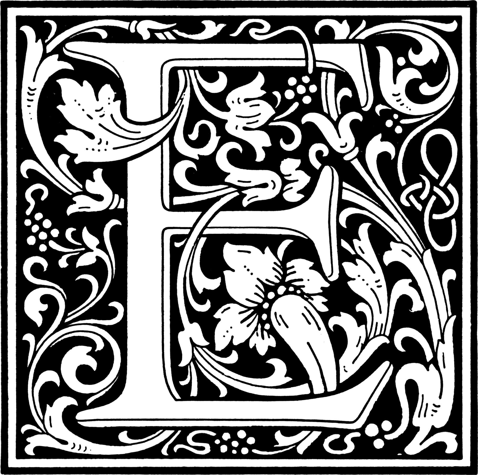
So, as far as I can tell, your arguments are that that a normal font is nothing more than the alphabet, therefore there’s no art in it, and therefore the creator shouldn’t have any claim to it.
My argument is that every detail is an artistic choice, and that simply making it look aesthetically pleasing or distinctive is art. If fonts weren’t art, why would people even bother with different looking fonts?
But regardless of the art question, if the creator can’t license their fonts, it would mean that they get no compensation for when some company uses their work.
I chose a very extreme example, but it’s still just a stylized E, used for text. My word processor also has lots of different E’s to choose from, all stylized differently.
nor does it represent the letter E. It IS the letter E.
I have E’s that have serifs. The concept of letter E doesn’t say anything about that, but some fonts have them and others don’t.
Where do you draw the line? Serifs? Embossing? Floral motifs?
I designed a stylized E. Which side of the line does it belong?


There was a quite a bit of discussion about that on another post: https://lemmy.world/post/39297021

Measuring size alone is meaningless, as gameplay affects perceived size, and density of meaningful content in relation affects the experience.
Size should match content.
Skyrim is canonically pretty close to the size and shape of Estonia, but in game it’s very small. If the game’s content was spread out to the “real” size, it would feel completely barren.
The map in Deus Ex MD was quite small, just a couple tiny districts, but it punched way above its size because it was so dense in detail.
Hmm, I remember from one of the developer commentaries that only future levels should get tuned, not the one player is currently on. Maybe the intro level was an exception.
Maybe it was the other way